Float – site & product
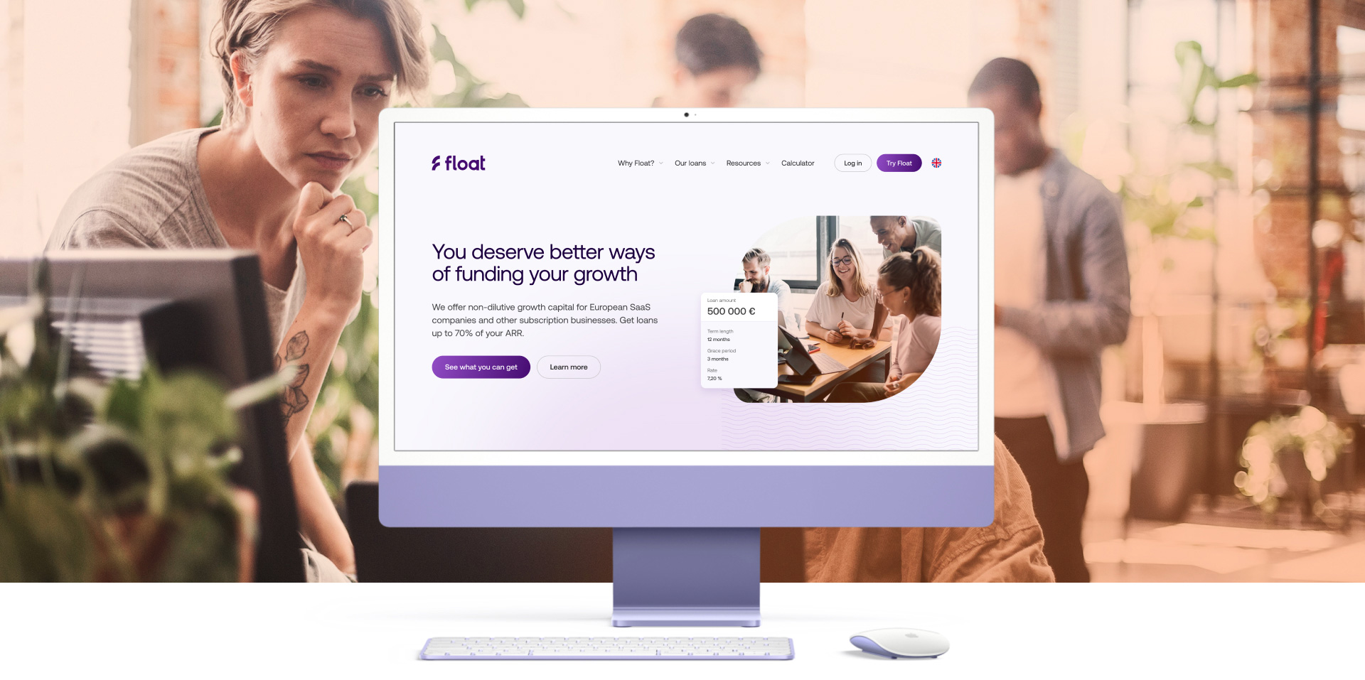
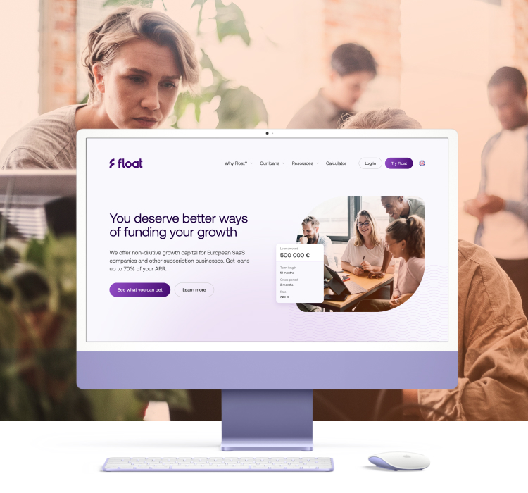
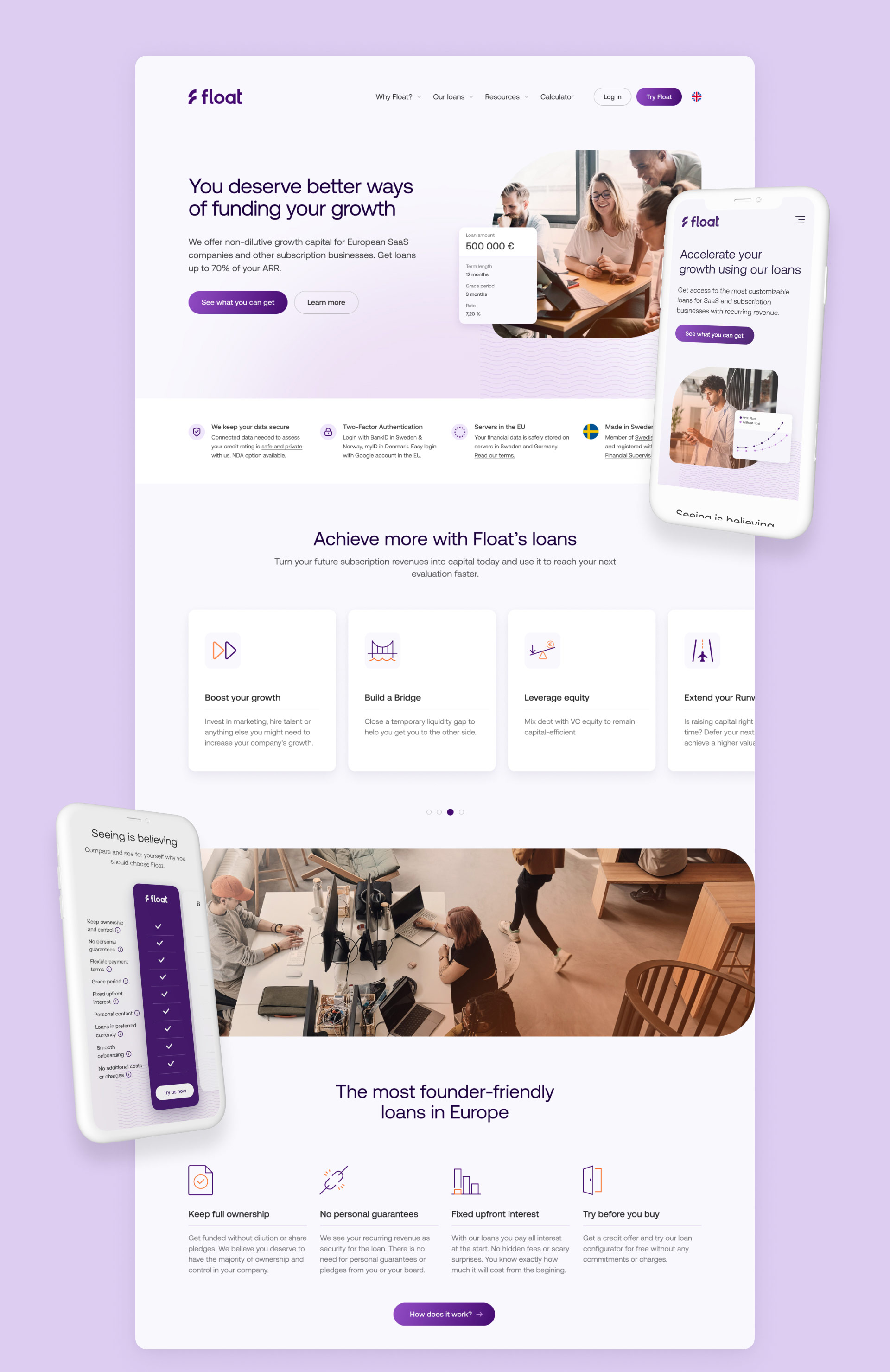
Float is a fintech company based in Stockholm that provides non-dilutive capital to SaaS and other subscription businesses as an alternative way of funding their growth. Float had an MVP of their product out but wanted to accelerate their client conversion.
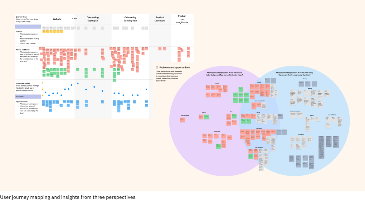
Me together with our PO gathered insights and analysed data from three perspectives: the user, the business and tech to understand the barriers to conversion as well as what pain points to act on. We then procedeed to completely redesign Float’s website and product from the ground up in order to maximize for user conversion and brand experience.
Svea launched Swedens first bank for small to medium size companies. With focus on high automatisation and totally digitalised banking functionality. Svea Bank is the first bank in Sweden with a fully automated onboarding for companies, both existing and new. No paperwork needed.
My responsibility as lead Art Director from the start was the overall visual design, feel and experience of the product. Both from a UX/UI perspective as well as a brand perspective. Elevating Svea Bank as a disruptive brand with a friendly tonality in the nordic bank sector. As part of the continuous work me and the design team have produced concepts, wireframes and prototypes that have been tested and validated to create an innovative banking platform. I have set up and developed a design system from the ground up with guidelines ranging from brand colors to complete components that can be reused not only by the bank team but all other teams at Svea as well.
Float is a fintech company based in Stockholm that provides non-dilutive capital to SaaS and other subscription businesses as an alternative way of funding their growth. Float had an MVP of their product out but wanted to accelerate their client conversion.
Me together with our PO gathered insights and analysed data from three perspectives: the user, the business and tech to understand the barriers to conversion as well as what pain points to act on. We then procedeed to completely redesign Float’s website and product from the ground up in order to maximize for user conversion and brand experience.
CLIENT
Float
YEAR
2022–2023
ROLE
Art Direction / Product design / UX / Concept development
ROLE
Art Direction / Product design / UX / Concept development

Updated brand experience
Updated brand experience
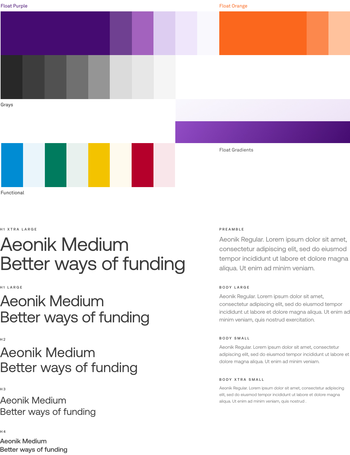
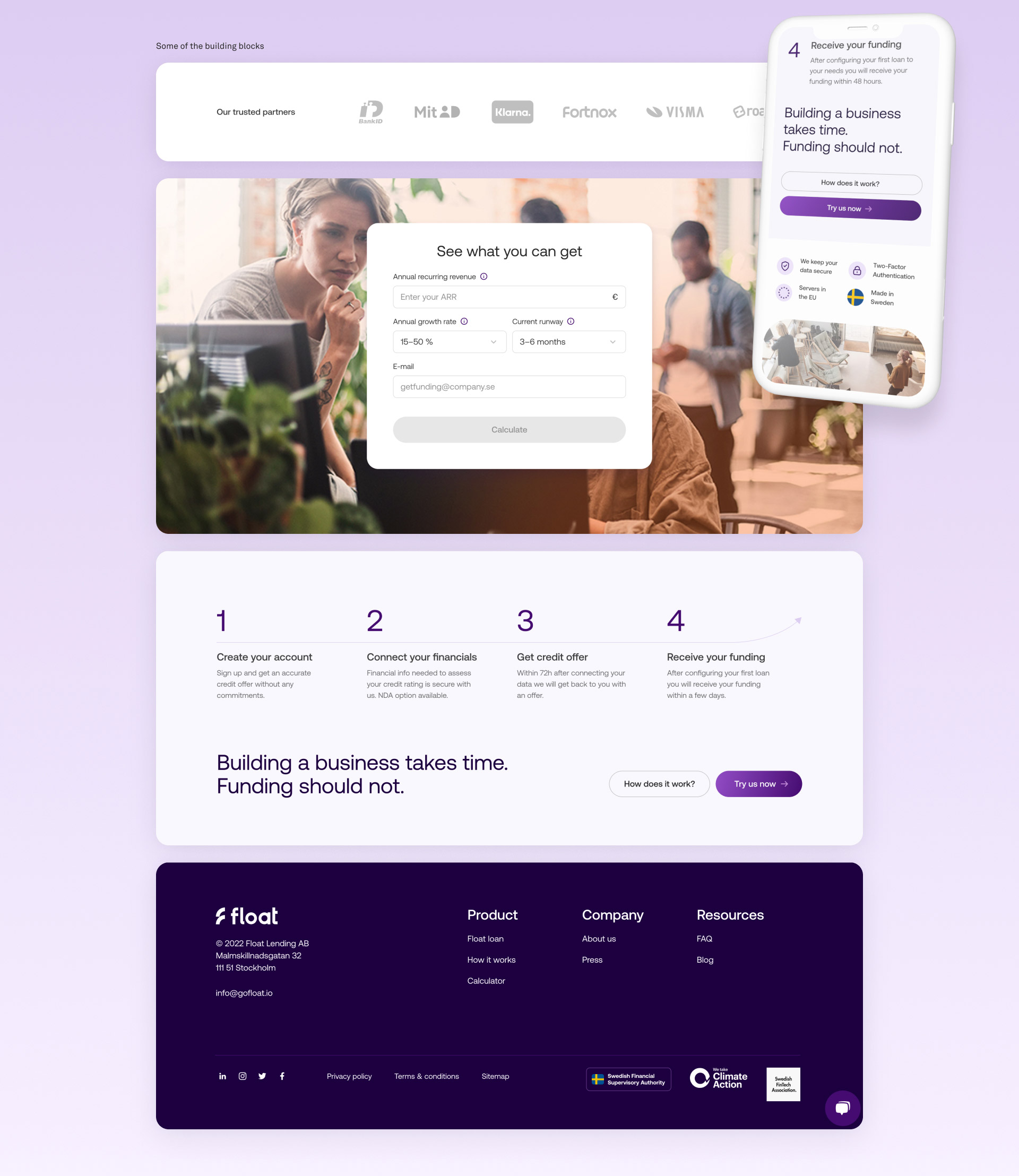
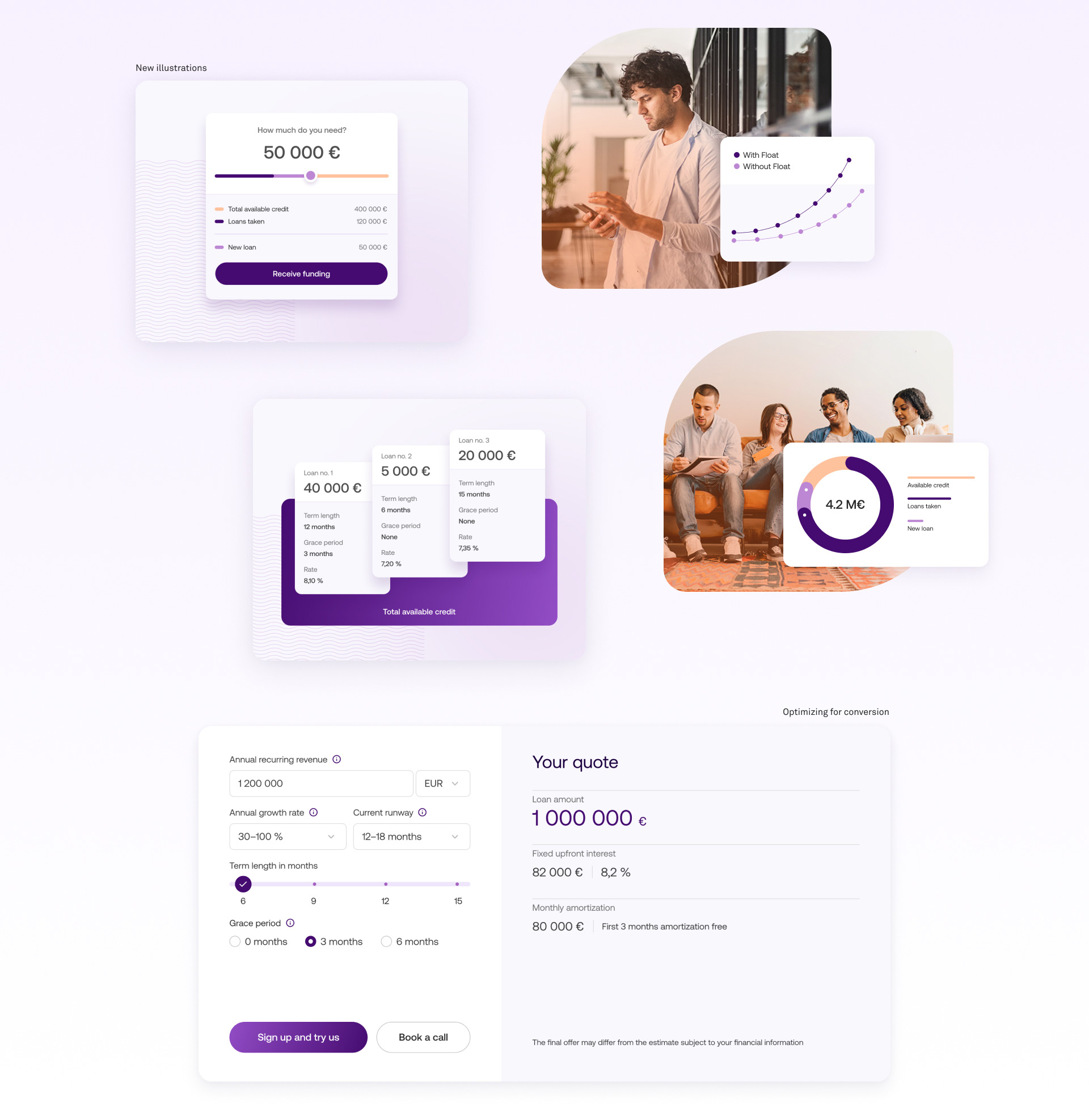
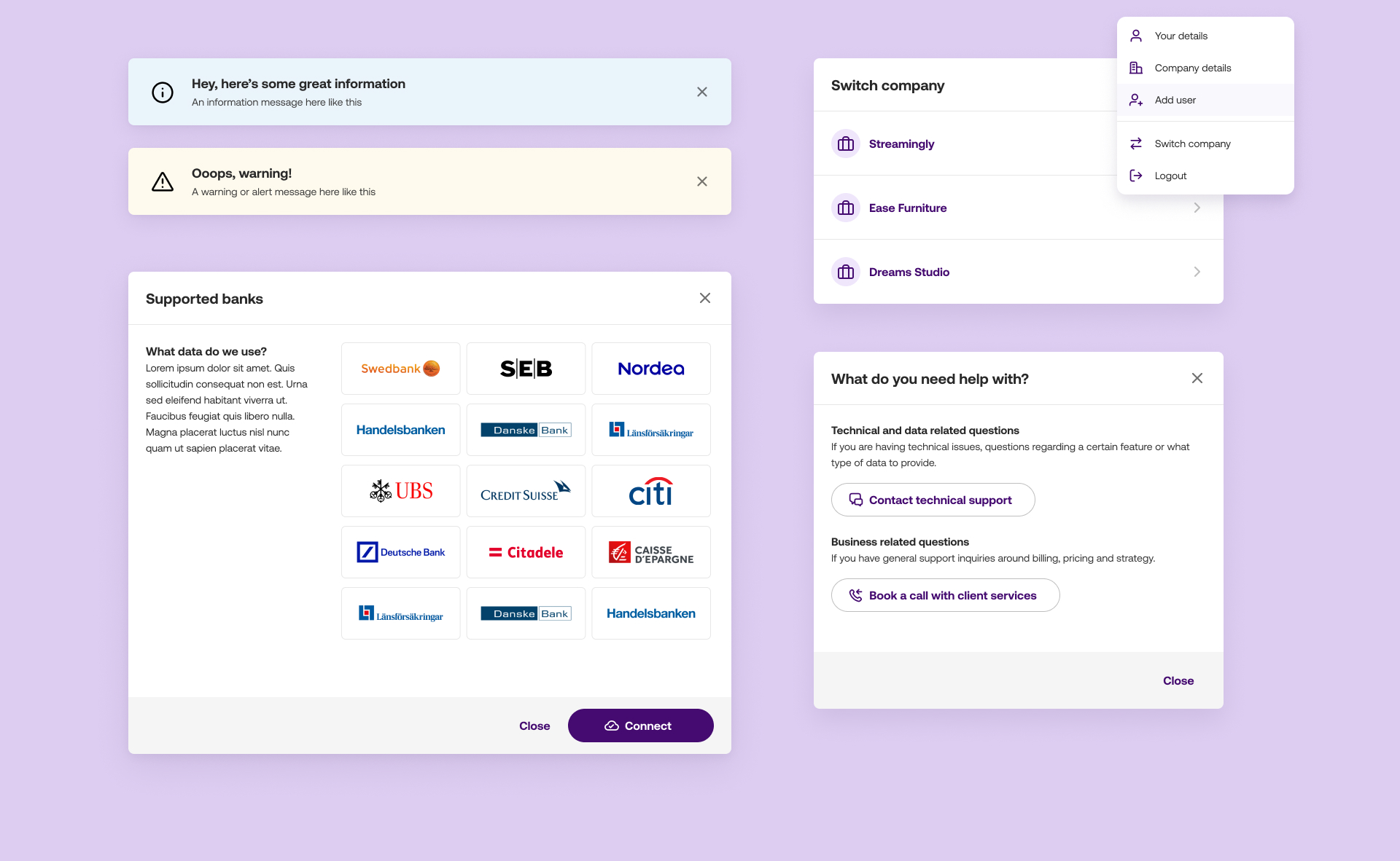
Based on the insights from the research Float’s online brand presence needed a rework with a focus on the overall visual quality and detail. Additional brand and functional colors were brought in to support the growing product. The typographic hierarchy, as well as all graphical elements, illustrations, and imagery, were redesigned for the website and product.
To ensure quality, a design system in Figma was set up with updated UI components, colors, typography, and spacing. This will also make future design and implementation improvements easier.

UX improvements
UX improvements
We did customer interviews, usability testing, and analysed web analytics data to understand the customers needs and their behavior. We then facilitated three different workshops with stakeholders at Float. The research revealed that a large number of customers left the site early on and that there were several important undiscovered pain points to handle throughout the user journey. There were also some small trust issues with the brand image that needed to be addressed.
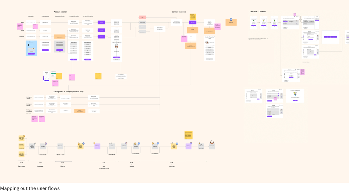
I created hi-fi prototypes in Figma with new flows and improved content based on our wireframes, which we then tested on Float's potential clients to validate our ideas. I iterated on the final hi-fi designs of the responsive site and product based on those feedback sessions.
I worked closely together with Float and the development team throughout the project to ensure quality in every detail.
Customer onboarding
Customer onboarding
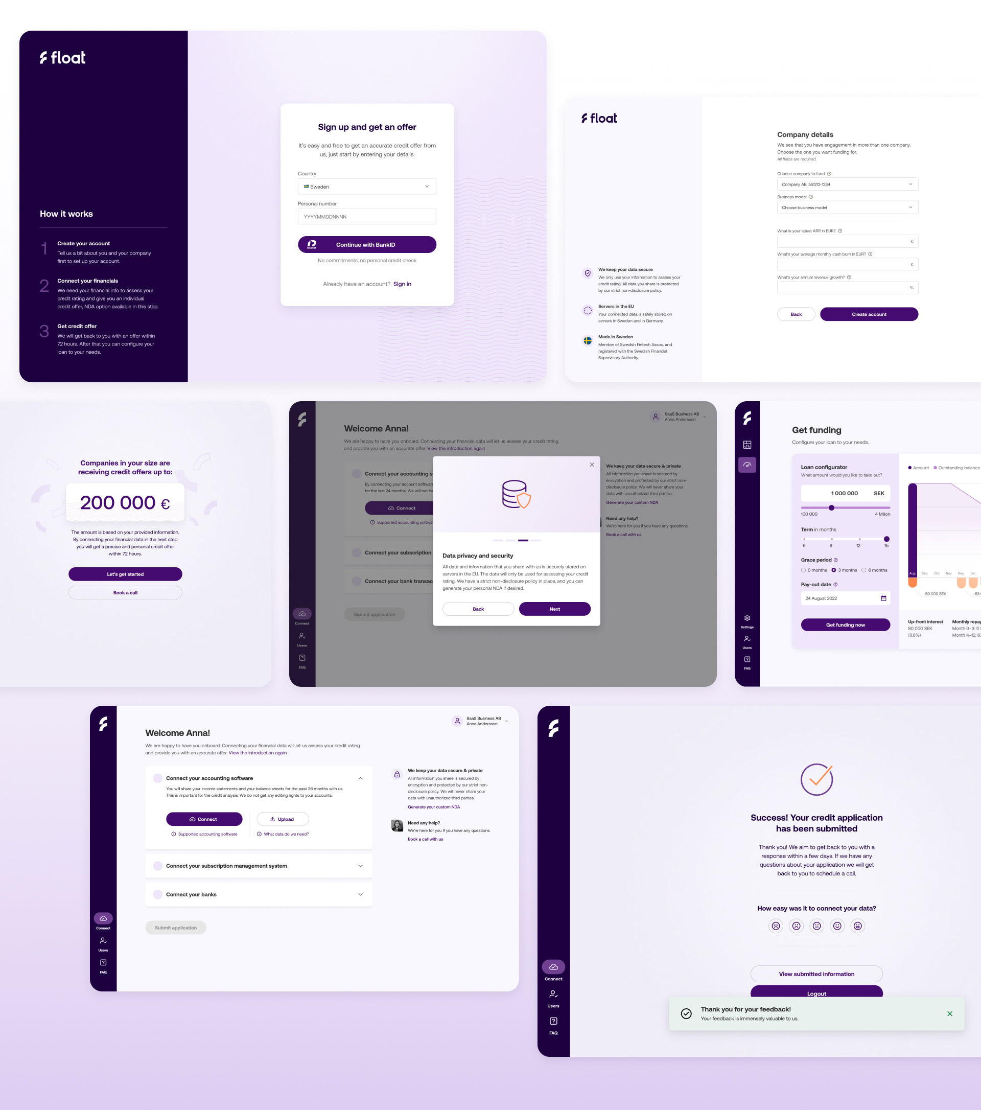
Our top priorities for the product were to improve the onboarding's usability and build greater trust by emphasizing the strong security and privacy features through updated content. A significant amount of time was invested to achieve the highest quality in the UI design as well as optimizing the user flow to reduce potential barriers.
Our top priorities for the product were to improve the onboarding's usability and build greater trust by emphasizing the strong security and privacy features through updated content. A significant amount of time was invested to achieve the highest quality in the UI design as well as optimizing the user flow to reduce potential barriers.
Results
Simplifying a complex onboarding
Results
We were able to optimize Float's website thanks to the user insights and data-driven design process. The redesigned onboarding flow and website increased user engagement by 63 % and improved conversion rate by 450 % for MQLs. Also, the bounce rate for the website decreased by almost 50 %. Usability testing and costumer feedback validated the design changes and provided insights for continuous optimization.
Design team and development teams have worked closely together to create and develop a fully automated onboarding for small businesses. The existing business owners can today become full bank customers in under 7 minutes. Start ups who register and create their company with Svea can also become customers completely online. This thanks to the advanced automated system and connections to Bolagsverket. The first of its kind in Sweden.
We were able to optimize Float's website thanks to the user insights and data-driven design process. The redesigned onboarding flow and website increased user engagement by 63 % and improved conversion rate by 450 % for MQLs. Also, the bounce rate for the website decreased by almost 50 %. Usability testing and costumer feedback validated the design changes and provided insights for continuous optimization.

Mattias Kristensson
Art Director
Mattias Kristensson
Art Director